Two Ways to Approach a Rebrand (And A Short Lesson in Neuroscience)
The banking industry is competitive, and it’s changing rapidly. Those are both massive understatements. As customer wants and needs are evolving, and technology is changing how we interact with our money, the way banks connect with customers has had to evolve at a similar pace. At the same time, how they show up visually and engage with those customers has also had to evolve. Here are two examples of what that looks like…
HomeTown Bank
Last year, we collaborated with HomeTown Bank here in Minnesota, working with them to roll out a full visual rebrand. For years, the existing eagle logo had represented the HomeTown Bank brand in the communities they serve, but the time had come to move the bank’s visual identity forward.
![]()
Over months, we worked closely with the team at HomeTown Bank, guiding them through the rebranding process. We began with our Bootcamp process, creating space for the bank’s team to have conversations about the brand’s personality, core values, customers, and why they do what they do. We explored what differentiates HomeTown Bank in the marketplace and what brands, outside their industry, align with who they are.
Then, we got to work imagining what the new HomeTown brand could become and what directions we could take a new identity visually. Again, collaborating with HomeTown Bank’s leadership team, we went through the process of building, taking apart, and putting back together until we landed on a new logo that captures the energy of both HomeTown Bank and the communities they serve.
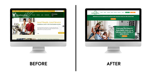
The new logo and identity capture the personality and conversations we had in those meetings, talking about the bank’s core values, commitment to their customers, and the energy they bring to their work. We kept the font and the green color palette but brightened things up to modernize the HomeTown Bank brand for 2022 and beyond. The result is a big departure from the original logo, immediately recognizable to customers and positioning HomeTown bank as a leader for the future.
US Bank
So what happens when you want to make a change, but you don’t want anyone to notice? For example, we recently saw this new US Bank logo and did a double take. It looked different, but it wasn’t until I compared it to the original logo that I could see what had changed.
![]()
The difference between the two is simply the use of a new font. Doing a quick Google search, there’s not much chatter around this change, and digging even deeper, the change has not been rolled out across the full brand yet.
So why make a change like this? Wouldn’t it be easier to leave things alone, and will this have any impact on brand perception?
The answer is simple and complex at the same time. It could be easy to think that a change as subtle as this one would have little to no impact on the brand. Is this evolution enough to convince me to become a US Bank customer? Consciously, maybe not. But subconsciously, there’s a strong possibility. Here’s what we mean…
A recent article on Neuroset.net shared, “When you see a logo, you can tell whether it belongs to a liked or disliked brand that has made you happy or unhappy in the past. Based on how the brain perceives it, you may feel motivated to buy that brand product(s) or be totally withdrawn from doing so.”
From that article, our brains analyze a logo’s shape, color, size, position, and brightness in milliseconds. It also looks for the presence of edges, round parts, symmetry, and shadows. Then, all that information is being scrubbed for the logo’s emotional content, or better put, the answer to whether it creates positive or negative feelings or a sense of trustworthiness.
In a split second, we make decisions based on what we see.
Without knowing the full backstory of the US Bank logo update, it’s probable that some of this thinking and research is behind making this subtle tweak to the brand identity. And at the same time, it’s also likely that this will change how the brain sees and reacts to the logo.
Call-to-Action
What does this mean for you? Without diving too deep, it’s a simple reminder that your logo actually matters and possesses more power than you might be giving it credit for. Think for a moment about how your brand is being perceived in the marketplace today, look at what your competitors are doing, and assess where you’re at.
Ready for more?
OrangeBall Insights has always been a place to share ideas, explore our purpose and leadership, and chat a little bit about marketing. If this resonated and you’d like to receive weekly ways to bounce higher every day, subscribe here.