Does Your Logo Really Matter?
What Kind of Story is Your Logo Telling?
Nike and their swoosh. Target and their bullseye. Starbucks and their mermaid. Barbie with her pink signature. Apple with their… apple.
We’ve been doing a lot of logo designs lately, and it got us thinking… For these familiar, global brands, their logos are simple marks that signify something much more significant. They represent the experiences and emotions that we associate with each brand. There’s a bond or connection that we form with these images – they immediately generate feelings. Whether those feelings are positive or negative, these simple marks mean something to us.
So what if you’re not Nike or Apple? Does your logo really matter, and is it something you should pay any attention to?
It can be easy to brush off the importance of a strong logo, but the reality is that your logo makes an incredible statement about you and your brand. We may have shifted from handing people business cards to having them visit our websites, but the reality is this… your logo creates a massive first impression. And, if it is dated and dusty, your brand will start to feel dated and dusty as well.
Here’s a powerful example that we’ve come back to time and again as we’re chatting with clients. Farmers Insurance has been around since 1928. They’re a trusted brand and leader within the insurance industry, but there came the point where their logo began to look dated and irrelevant. At that point, it was fifty-five years old. In 2013, they made a move to change that.
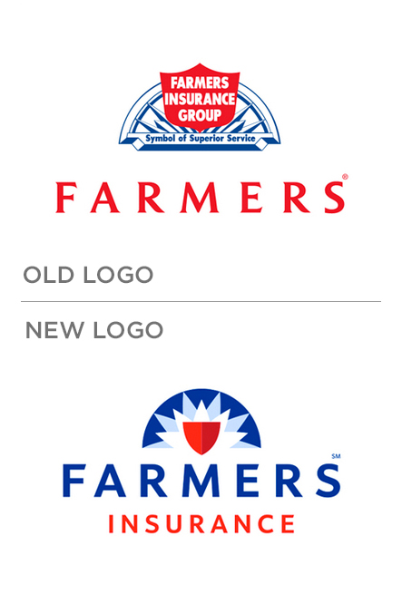
The change wasn’t substantial – the colors are the same, the shield is still there, and the medallion behind the logo remains in place. That said, the subtle shifts that were made created an important difference in how it is perceived by the public today. The new logo feels modern, contemporary, and fresh – while still holding onto the feelings of strength and confidence that the old logo possessed.
The best part about this logo transformation? It held on to just enough of the original mark’s heritage and tradition that many people, including clients, never realized it had changed. The moves they made to update this mark were intentional and strategic. They weren’t jarring or upsetting to their current customers, and they were attractive and magnetic to a new audience.
So with that in mind, it may be an excellent time to review your own logo. If you see that dated and dusty look that we mentioned earlier, your customers and clients probably see the same thing. If your organization has evolved or shifted, you may want to consider that. More than anything, ask yourself this simple question: Does our logo inspire the reaction we want from the people we want to work with?
Call-to-Action
Your logo is a powerful tool. It’s one of the elements that helps kindle the feelings people have about your brand. Making sure it matches the experience you deliver, the caliber of the work you do, and the core values you believe in is critical. If it doesn’t, start making some moves to change that.